...good programs are designed. We make choices that favour clarity, simplicity, and elegance.
Chapter 7.2, How to Think Like a Computer Scientist: Interactive Edition
In this module you'll explore logical operations, such as
boolean values and selection,
precedence of operations,
if/else statements and functions,
nested conditionals, and
more unit testing,
In addition, you'll read about Matplotlib and NumPy librarires
to help improve the ability to plot external data.
In class, you'll
update your Python Concept Reference Sheet,
install the Matplotlib and NumPylibraries,
and work together to create a grouped bar chart that
compares the nutritional values of blueberries and raspberries.
Then, you'll create a program that will read and split data from three columns of an external .csv file
and plot it on the x and y axis of a Matplotlib chart with the help of the NumPy library.
It will include design of the figure (chart window/canvas), titles and labels,
and bars using a variety of colors and font options.
In your existing small group, collaborate in your existing Google Sheets or Excel file
to describe the new
Selection options presented in chapter 7 and
Matplotlib options as presented in the Matplotlib documentation.
Continue to add to the list as you progress through the chapters.
Add Matplotlib & NumPy
VS Code's list of Python installations and packages. Pip is needed to install Numby and Matplotlib.
So that we can create more sophisticated data visualizations using Python,
we'll add
Matplotlib and NumPy, two common plotting libraries. They are easily installed in VS Code as long as you have
Python 3 installed.
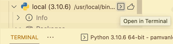
In the VS Code main menu, click on the Python extension icon.
Check to confirm that you have Python 3.10+ installed. Open that folder to see which packages are installed.
Click the right arrow of the Python 3 in the list to get to its terminal.
From the Python 3 Terminal, run the install command for your computer platform:
Linux (Debian)apt-get install python3-tk
python3 -m pip install matplotlib
To update Pip to the current version, run, pip3 install --upgrade pip
Once pip is installed, you may need to also type this in the terminal:
pip3 install matplotlib
This will install several libraries, two of which are needed for this activity (*):
six
pyparsing
numpy*
kiwisolver
fonttools
cycler
python-dateutil
packaging
matplotlib*
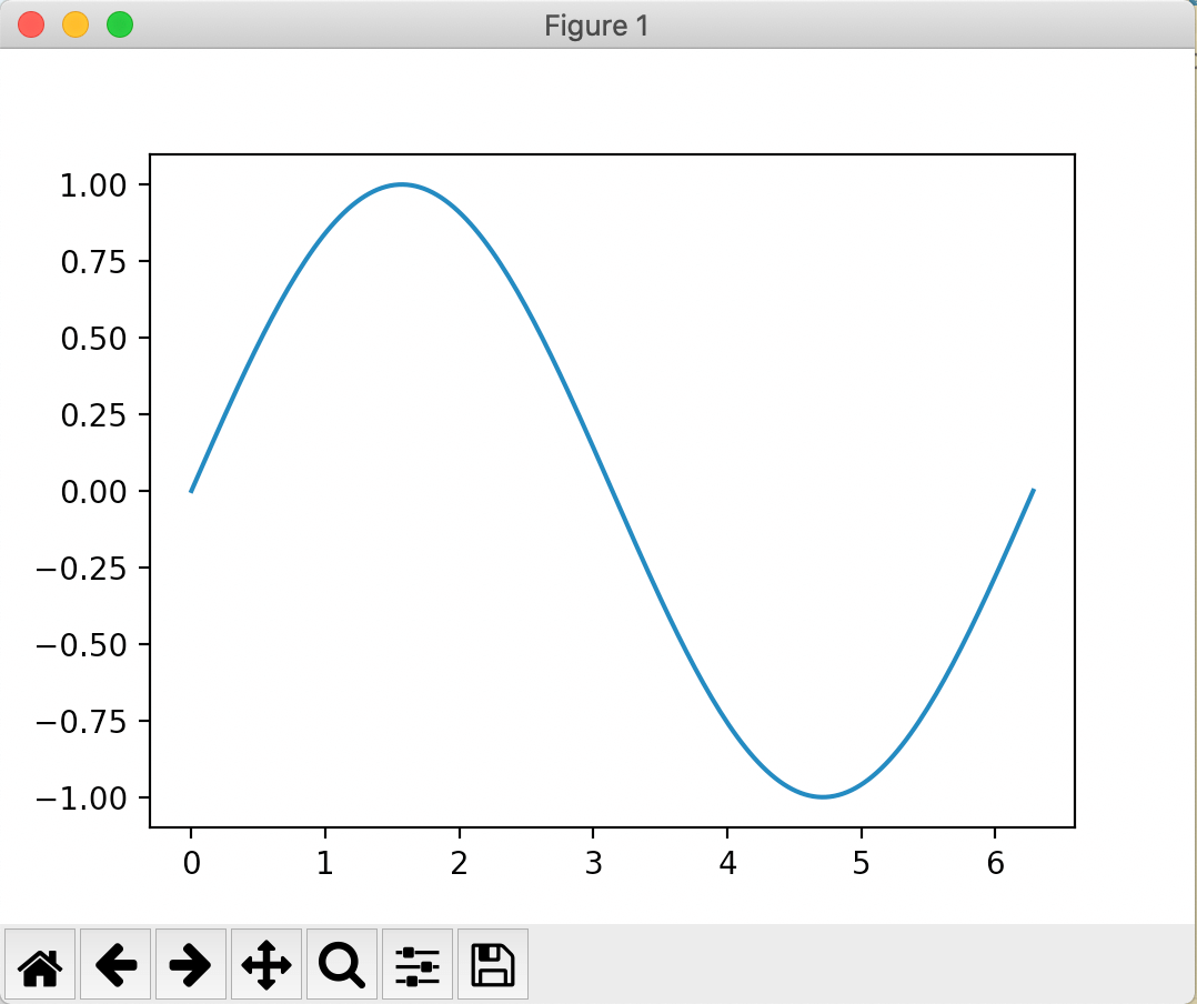
Add a new file to your workspace folder called mpl-graph.py to test the installation.
In the new file, add the following code to create a line graph:
import matplotlib.pyplot as plt
import NumPy as np

x = np.linspace(0, 2 * np.pi, 200)
y = np.sin(x)

fig, ax = plt.subplots()
ax.plot(x, y)
plt.show()
The output should look like this:
Output from a beginning level line plot using matplotlib with Python.
Experiment more with Matplotlib and NumPy
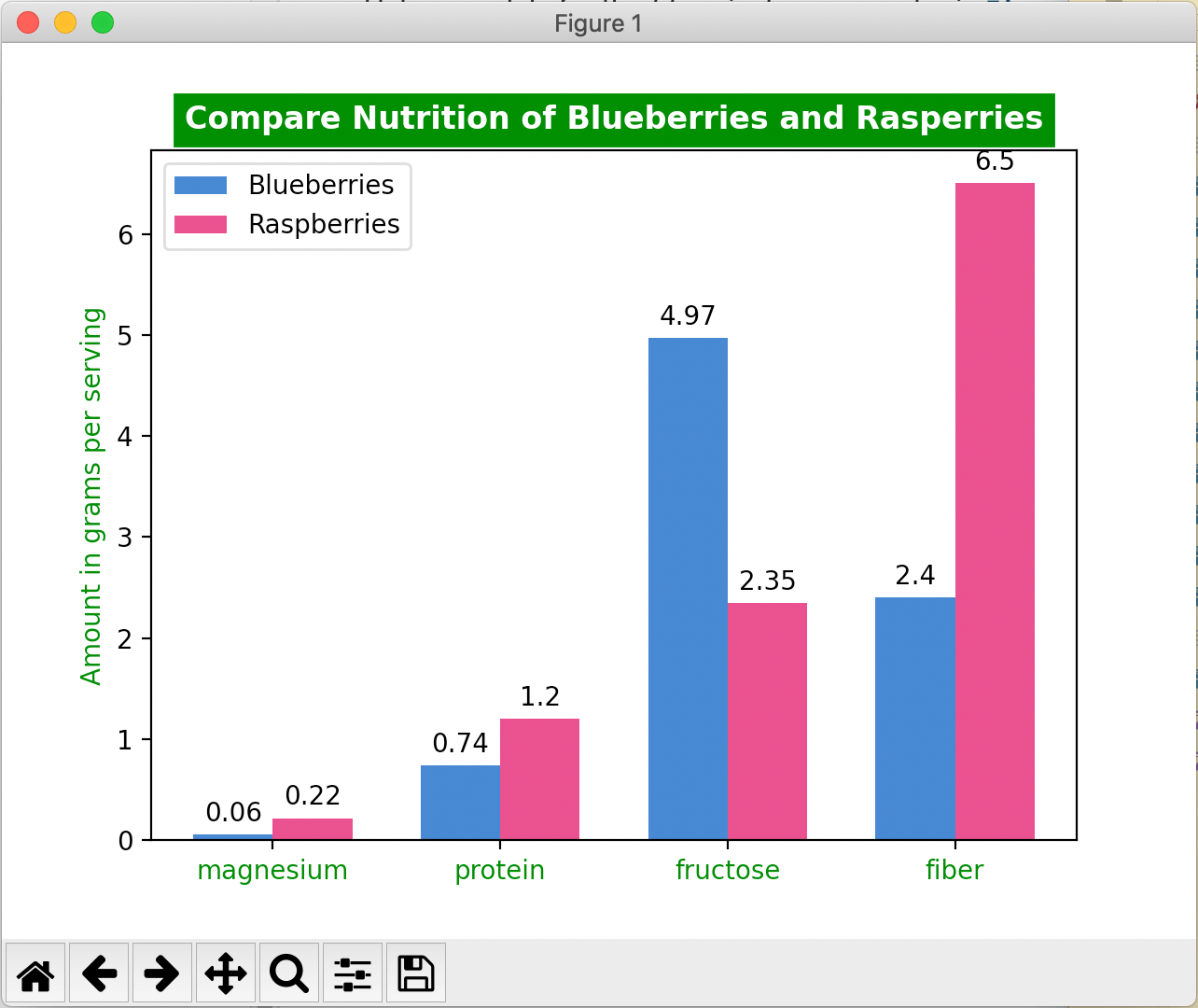
Compare the Nutritional Values of Blueberries and Rasperries
Instead of comparing men and women scores,
compare the nutrition of blueberries to raspberries.
based on data from the Versus website.
Set the figue and axis to plt.subplots() constrained layout to False: constrained_layout=False
and remove the deprecated tight_layout() option.
Refer to
Creating multiple subplots using plt.subplots
Set the title to Compare Nutrition of Blueberries and Rasperries in
bold, white text on a
green background
vertically-aligned at the bottom.
Refer to the Axes.set_title() parameters.
Specify grams on the Y axis label in green.
Specify magnesium, protein, fructose, and fiber on the X axis.
Define two variables; one for blueAmts and one for raspAmts
as lists that contain the data provided by the Versus website.
Define the value of x as the length of the labels with np.range(len(labels)) (this can be left as is).
Set the xticks to green.
Define the bars:
Define a width for each bar.
Define the blueberry rectangle as x minus the width divided by 2,
the blueAmts data, a label called "Blueberries", and a blueish hexidecimal* color that looks like blueberries.
Define the raspberry rectangle as x plus the width divided by 2,
the raspAmts data, a label called "Raspberries", and a redish hexidecimal* color that looks like raspberries.
For each rectangle, specify the amount of padding/space between the label and bar.
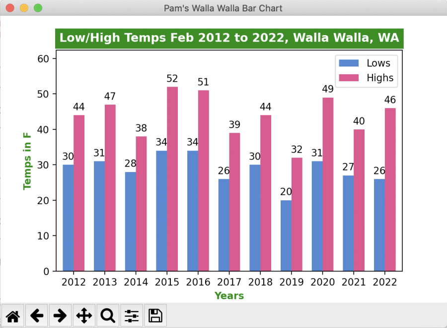
Program 6 will require skills learned in Module 6 and 7's readings and in-class activities.
The program will read and split data from three columns of an external .csv file
and plot it on the x and y axis of a Matplotlib chart with the help of the NumPy library.
It will include design of the figure (chart window/canvas), titles and labels, and bars using
a variety of colors and font options.
Program 6 involves taking data from three columns of an external .csv file
and plotting them on the x and y axis of a Matplotlib chart with the help of the NumPy library.
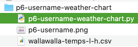
In the seventh module folder of your workspace folder,
make a new folder named p6-username-weather-chart.
In that folder, make a new file called p6-username-weather-chart.py
Replace 'username' with your ONID username.
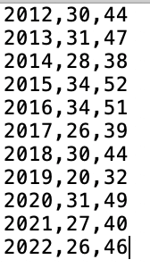
The data file includes three columns and eleven rows of data.Save the Data File:
Right-click to Save as... this
wallawalla-temps-l-h.csv
file to your new program folder.
This data file was generated from the
PRISM Explorer, which is provided by the
Northwest Alliance for Computational Science & Engineering (NACSE), based at Oregon State University.
Write commands in the .py file to do the following:
Comment with your
first and last name, the
date, the
name of this assignment "Weather Chart", and a
paragraph that describes the data, functions, and output of the program.
Set the figure and axis subplot area to turn off constraint.
Title the figure canvas window with your name and program name using one of these commands:
fig.canvas.set_window_title('...') or
fig.canvas.manager.set_window_title('...'), or
plt.get_current_fig_manager().set_window_title('...')
Set the axis chart title with the following parameters:
Add margins to the top of the chart so the values don't touch the top border:
plt.margins(x=.02, y=.2)
Define three empty NumPy arrays for the years, low, and high temperatures.
Here is the first one, for reference:
years = []
Use the with... function to open, read, and split the data file
into a variable that represents all three columns in each row of the data.
Change plots to something unique and memorable:
with open('wallawalla-temps-l-h.csv','r') as csvfile:
    plots = csv.reader(csvfile, delimiter = ',')
Also, you'll need to use a loop to grab the data from each row's column 1, 2, and 3 and
append it to the empty arrays created in the previous step:
    for row in plots:
        years.append(row[0])
        name2.append(int(row[1]))
        name3.append(int(row[2]))
Use the variable names you created instead of plots, name2, and name3.
At this point in the program, it is wise to check that the data is properly importing by
printing the data to the console. Print within the for loop.
print(', '.join(row))
Define the X axis details:
Define x as a range of the length.
Set the x tick marks to years.
Label the X Axis "Years" in bold green using ax.set_xlabel().
Label the Y Axis with Temps in F in bold green.
Set the width of each set of bars/rectangles using a floating point value, something like:
width = 0.35
Define two variables (one for each bar (highs and lows)) that divide the width of each bar by 2,
so that the low temperature bars fit together next to the high temperature bars
in the space allotted. Include the calculation, array name, label*, and color parameters.
* The label gets used in the Legend.
Add padding to the top of each of those new bars.
Automatically render the legend based on the two new bars.
Plot the chart in full upon running the program.
Save the file using cntls or ⌘s.
Run the program using one of these methods:
Click the run arrow ▶ at the top right of the editing screen.
In the terminal, type: python p1-username-datatypes.py
Right-click on the file in the file list (or from in the file)
and choose Run Python file in terminal.
Take a cropped screenshot of the final output of your program.
Windows:
Start → All Programs → Accessories → Snipping Tool
New → Rectangular Snip to select just the portion of the window and screen you need to show.
Or, newer Windows computer systems may use the Snip and Sketch tool's WindowsShifts keystroke.
Save the file as .png and move it to your module folder.
MacOS: ⌘Shift4 to draw a marquee around just the canvas/window of your app.
Or use the Preview application to capture, edit, and save the file.
Applications → Preview → File → Take Screenshot → From Selection.
Drag the crosshair cursor over the area you want to capture.
The image saves in .png format.
Edit as needed.
Or, you can use the searchsearch bar on the top right of the Finder to search "screenshot."
The screenshot crosshair cursor will pop up automatically.
Select the area you want to capture and it will save a file to the Desktop.
Move the resulting .png file to your module folder.
Chromebook: CtrlShiftOverview:
The screenshot crosshair cursor will pop up, so you can select just what is needed.
Move the resulting .png file to your module folder.
Backup your work to a cloud drive and/or USB stick drive.
Limitations
Font sizes must fit well within their areas and be legible....
not too big or too small to read, and not touching other items.
Use one or more color modes (examples are for the color green):
C0 to C9, such as 'C0'
Names, such as 'green'
Letters, such as 'g'
hexidecimal, such as '#7bd259'
RGB, such as 'rgb(123, 210, 89)'
Extra Credit
To earn 5 extra credit points, change your Weather program to
use functions for designing and plotting the data.
Submit Program 6
Zip a single folder that includes all three files.
Zip the folder that contains three files:
p6-username-screenshot.png,
wallawalla-temps-l-h.csv data file, and the
p6-username-weather-chart.py files.
Upload the .zip file to the Module > Assignment in Canvas.
The Instructor/TA will download the zip archive and run your .py files to score them.
Mac
Select the file(s) and right-click to choose Compress files.
Windows
Select the file(s) and right-click to choose Send to... → Compress (Zipped) archive.
Chromebook
Select the file(s) and right-click to choose Zip selection.
Respond to Feedback
Within 3 days of your submission, check the Canvas → Grades area
to view your score in the Rubric, along with our feedback.
Respond to the feedback if you have questions, by replying in the
Grades → Assignment → Comment box.

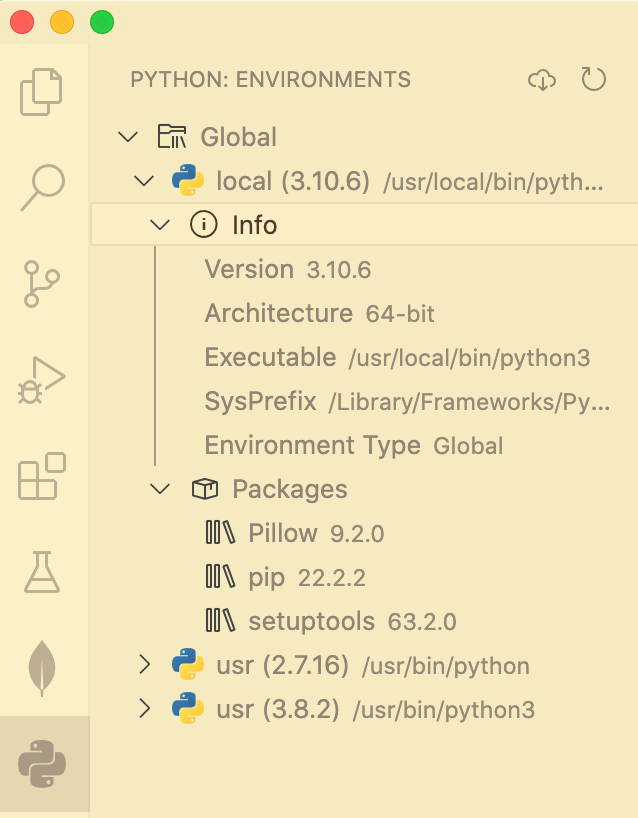
 Check to confirm that you have Python 3.10+ installed. Open that folder to see which packages are installed.
 Start → All Programs → Accessories → Snipping Tool
New → Rectangular Snip to select just the portion of the window and screen you need to show.
Or, newer Windows computer systems may use the Snip and Sketch tool's WindowsShifts keystroke.
Save the file as .png and move it to your module folder.
Start → All Programs → Accessories → Snipping Tool
New → Rectangular Snip to select just the portion of the window and screen you need to show.
Or, newer Windows computer systems may use the Snip and Sketch tool's WindowsShifts keystroke.
Save the file as .png and move it to your module folder.
 Applications → Preview → File → Take Screenshot → From Selection.
Drag the crosshair cursor over the area you want to capture.
The image saves in .png format.
Edit as needed.
Applications → Preview → File → Take Screenshot → From Selection.
Drag the crosshair cursor over the area you want to capture.
The image saves in .png format.
Edit as needed.